NativeScript: Accessibility font scaling
As a part of making our apps more accessible for our partially sighted users, we want to support scaling texts in our app.
On Android the texts on labels and buttons is scaled by default, we don’t need to do anything to support it. We might want to fix the layout when this happens.
On iOS on the other hand doesn’t scale the text automatically, on iOS 10+ adjustsFontForContentSizeCategory can be used on a UILabel to have it scaled. Unfortunately this only works for prefered fonts, which is difficult to set from NativeScript.
Luckily @nota/nativescript-accessiblity-ext just added supports font scaling via CSS.
Getting started
Start by creating a new NativeScript project. I’m using Angular, but it will work just as well with NativeScript Core.
tns create projectname --ng

cd projectname
npm i
npm i --save-dev nativescript-dev-sass
npm i --save @nota/nativescript-accessibility-ext@^3.0.0-alpha.7 nativescript-globalevents
Create the SCSS files for the nativescript-theme-core
app/_app.common.scss
// Import the theme’s variables. If you’re using a color scheme
// other than “light”, switch the path to the alternative scheme,
// for example '~nativescript-theme-core/scss/dark'.
@import '~nativescript-theme-core/scss/light';

// Customize any of the theme’s variables here, for instance $btn-color: red;

// Import the theme’s main ruleset.
@import '~nativescript-theme-core/scss/index';

// Place any CSS rules you want to apply on both iOS and Android here.
// This is where the vast majority of your CSS code goes.
app/app.android.scss
@import 'app-common';
@import '~nativescript-theme-core/scss/platforms/index.android';
app/app.ios.scss
@import 'app-common';
@import '~nativescript-theme-core/scss/platforms/index.ios';
Now import the a11y-scss from @nota/nativescript-accessiblity-ext:
Add this to app/app.ios.scss:
@import '~@nota/nativescript-accessibility-ext/scss/a11y.ios';
Now we need to load import the plugin in our app/app.module.ts
Add this:
import { NgModule, NO_ERRORS_SCHEMA } from '@angular/core';
import { NativeScriptModule } from 'nativescript-angular/nativescript.module';
import '@nota/nativescript-accessibility-ext'; // <-- add this line
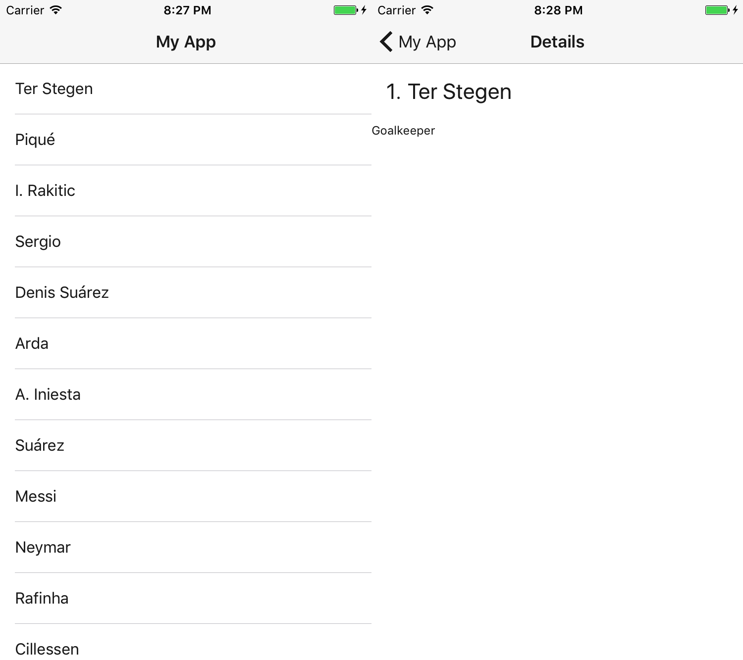
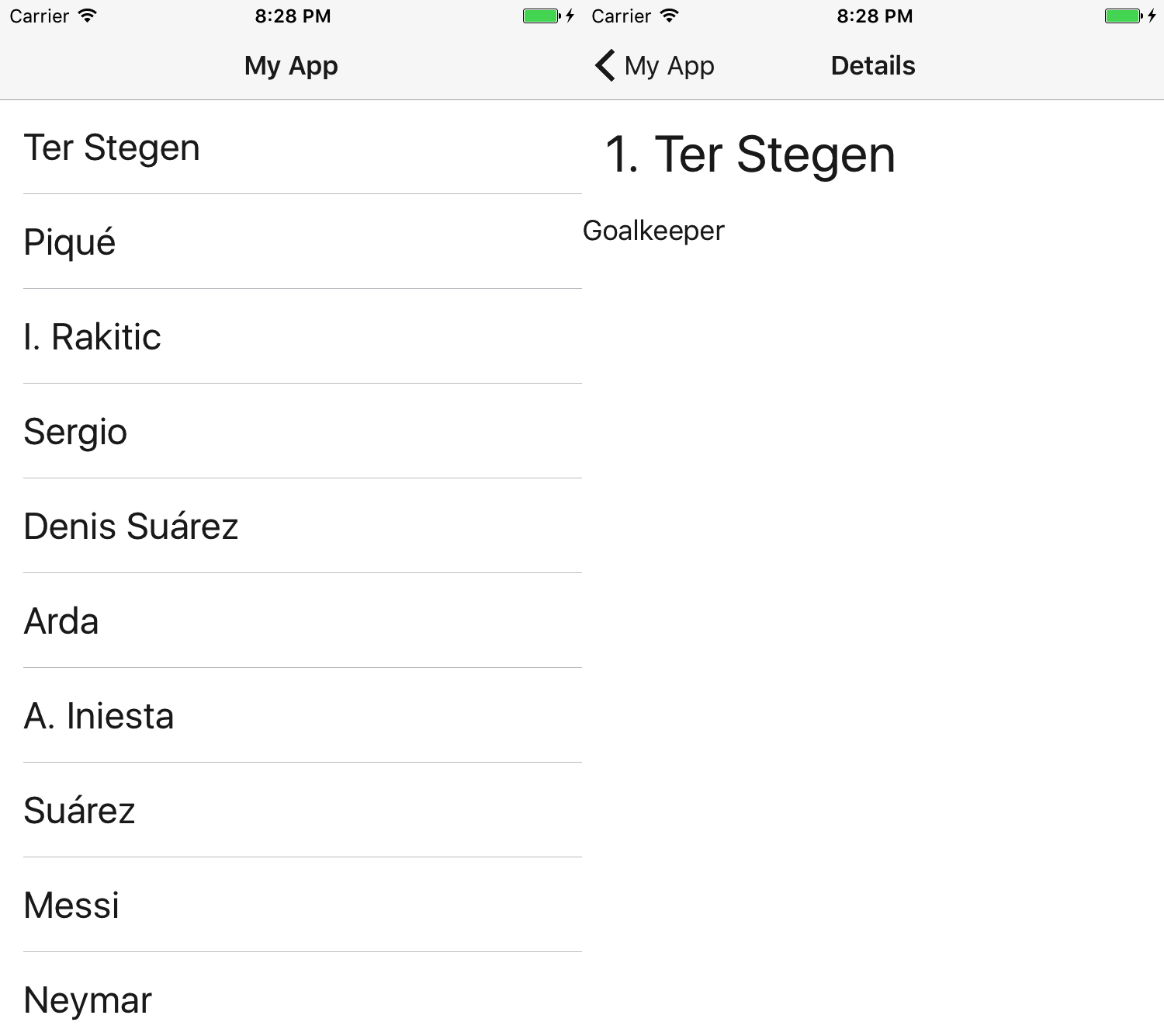
Screenshots
Text not scaled - iOS

Text scaled to 150% of normal - iOS

How does this work?
@nota/nativescript-accessibility-ext adds a class to the page matching the current font-scale setting:
- a11y-fontscale-50 *(iOS only)*
- a11y-fontscale-70 *(iOS only)*
- a11y-fontscale-85
- a11y-fontscale-100
- a11y-fontscale-115
- a11y-fontscale-130
- a11y-fontscale-150 *(iOS only)*
- a11y-fontscale-200 *(iOS only - extra large fonts)*
- a11y-fontscale-250 *(iOS only - extra large fonts)*
- a11y-fontscale-300 *(iOS only - extra large fonts)*
- a11y-fontscale-350 *(iOS only - extra large fonts)*
- a11y-fontscale-400 *(iOS only - extra large fonts)*
These classes are used to override the classes from nativescript-theme-core like this.
Page.a11y-fontscale-150 {
  .t-10 {
    font-size: 15; /* 10 * 150% = 15 */
  }
}
This is done for all the CSS-classes in nativescript-theme-core which touches on font-size.
Adding your own scaling style
If you use your own classes or you need to fix the layout when the text is scaled, you can easily do this yourself.
Enable listening for config changes on Android.
If you need to make adjustments on Android, you need to make a small change to your app/App_Resources/Android/AndroidManifest.xml.
Add fontScale to the android:configChanges-attribute on the <activity>.
The line:
android:configChanges="keyboardHidden|orientation|screenSize"
Becomes:
android:configChanges="keyboardHidden|orientation|screenSize|fontScale"
Writing your own style
Here I’ll scale an image.
Downloade the small image of a cool fez and save it to app/fezzes-are-cool.png.
Edit the file app/_app-common.scss.
@import '~@nota/nativescript-accessibility-ext/scss/fontscales';

@each $scale, $scales in $a11y-font-scales {
  $factor: map-get($scales, factor);

  $base-size: 50;
  Page.a11y-fontscale-#{$scale} {
    .scaled-image {
      height: $base-size * $factor;
      width: $base-size * $factor;
    }
  }
}
Edit the file app/item/items.component.html
<ActionBar title="Details" class="action-bar"></ActionBar>
<FlexboxLayout flexDirection="column" class="page">
  <FlexboxLayout class="m-15">
    <label class="h2" [text]="item.id + '. '"></label>
    <label class="h2" [text]="item.name"></label>
  </FlexboxLayout>
  <label class="h4" [text]="item.role"></label>

  <image class="scaled-image" src="~/fezzes-are-cool.png"></image>
  <!-- Add this line -->
</FlexboxLayout>
Now if you run the app and change the scaling level, you’ll see the image change size accordingly.
What about component styling.
This is almost the same, you’ll have to use the /deep/ selector.
And the SCSS will look like this:
@import '~@nota/nativescript-accessibility-ext/scss/fontscales';

@each $scale, $scales in $a11y-font-scales {
  $factor: map-get($scales, factor);

  $base-size: 50;
  /deep/ Page.a11y-fontscale-#{$scale} {
    .scaled-image {
      height: $base-size * $factor;
      width: $base-size * $factor;
    }
  }
}
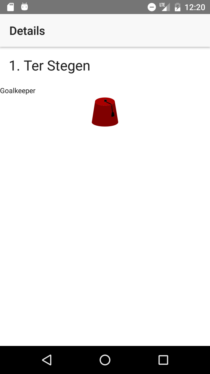
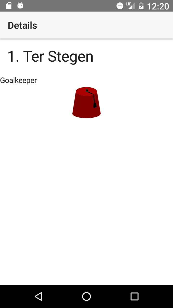
Screenshots
Fez not scaled - Android

Cool fez scaled 150% of normal - Android

What if it only applies to one of the platforms?
If it’s a global style, you can add it to the app/app.<platform>.scss-file.
Or if you use nativescript-platform-css, you can use platform classes like .ios and .android.
Install:
npm i --save nativescript-platform-css
Import in app/app.module.ts:
import { NgModule, NO_ERRORS_SCHEMA } from "@angular/core";
import { NativeScriptModule } from "nativescript-angular/nativescript.module";
import '@nota/nativescript-accessibility-ext';
import 'nativescript-platform-css'; // <-- add this line
Example CSS:
@import '~@nota/nativescript-accessibility-ext/scss/fontscales';

@each $scale, $scales in $a11y-font-scales {
  $factor: map-get($scales, factor);

  $base-size: 50;
  /deep/ Page.a11y-fontscale-#{$scale} {
    &.android {
      /* <- here */
      .scaled-image {
        height: $base-size * $factor;
        width: $base-size * $factor;
      }
    }
  }
}
Conclussion
Supporting our visually impaired users is very easy with @nota/nativescript-accessibility-ext.